OrdaSoft forum
Gallery not responsive. (0 viewing)
Joomla Gallery Support
 Favoured: 0
|
Gallery not responsive.


Gallery not responsive. 8 Years, 2 Months ago
Karma: 0
Gallery is set to display as 5 columns. this is fine on dektop devices, but on mobile the gallery thumbnails appear to be too small.
How can I get the gallery to display as one or two colums on mobile devices?
How can I get the gallery to display as one or two colums on mobile devices?
 Logged
The administrator has disabled public write access.

Re:Gallery not responsive. 8 Years, 2 Months ago
Karma: 102
Dear
You may try below, but this not tested and min image size will go from default layout.
You need in file
{your site}/components/com_osgallery/views/masonry/tmpl/default.php
find code
and replace to code:
Please backup this file first
Regards
Andrew
You may try below, but this not tested and min image size will go from default layout.
You need in file
{your site}/components/com_osgallery/views/masonry/tmpl/default.php
find code
| Code: |
osg.getImgBlockWidth = function (numColumns){ |
and replace to code:
| Code: |
|
Please backup this file first
Regards
Andrew
Logged
The administrator has disabled public write access.
Re:Gallery not responsive. 8 Years, 1 Month ago
Karma: 0
I just purchased and set up my gallery and have discovered the same problem. My gallery is set up as 3 columns and looks fine at desktop or larger pad sizes. However, when viewed on smaller devices like a phone it does not change to a single column and remains at three columns which makes the images look too small.
I saw this post and decided to try the solution before posting here but it did not work properly.
After making the changes, the gallery is now responsive with the images moving into one column on a phone sized screen but they are now only taking up 50% of the width of the screen. The other 50% of the screen is blank down the right hand side! Please see image attached which shows how it now looks after replacing the code as suggested.
Can you offer a solution to this? As it is I cannot use the extension like this.
Thanks
Jon
Logged
The administrator has disabled public write access.
Re:Gallery not responsive. 8 Years, 1 Month ago
Karma: 102
Dear Jon,
The other 50% of the screen is blank
There not 50%, there less then 50%(may be 49... ) so 2 columns can't appear.
But for 1 column layout look good. All bad if 3 columns layout will show as 2 columns(if you have different size original images) So you will see many gaps
Regards
Andrew
OrdaSoft team
The other 50% of the screen is blank
There not 50%, there less then 50%(may be 49... ) so 2 columns can't appear.
But for 1 column layout look good. All bad if 3 columns layout will show as 2 columns(if you have different size original images) So you will see many gaps
Regards
Andrew
OrdaSoft team
Logged
The administrator has disabled public write access.
Re:Gallery not responsive. 8 Years, 1 Month ago
Karma: 0
Hi Andrew,
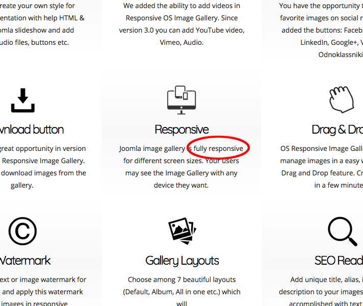
I think you are missing the point. I bought this in good faith believing the extension to be 'fully responsive’ as stated in the sales description on your website (see attached screen grab).
For that, I would expect the images to be in a single column and take up the full width of the phone screen regardless of their size. Most other portfolio extensions do this quite successfully as can be seen by this one:
extstore.com/demo#advanced-portfolio-pro
If you use the icons at the top of their page to swap to a small screen size you can see they have managed to have it working this way. Surely you are able to achieve the same result?
I have paid you $30 for an extension I cannot use for the purpose for which I paid for it. I am extremely disappointed by this. I expected better from your company.
Please prove that I am wrong to think like this and fix it. That's not to much to ask is it?
Logged
The administrator has disabled public write access.
Re:Gallery not responsive. 8 Years, 1 Month ago
Karma: 102
Hello
as you remember, This layout not exist in our gallery at all. This example we show only on our forum !!!!
So you self resolve use it or not.
Our Gallery works with "Masonry layout" on responsive otherwise.
ordasvit.com/os-responsive-image-gallery/
We not added this layout to our gellery because it may has errors like on demo what you show.
Please check attachment image.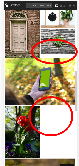
Regards
Andrew
Ordasoft team
Logged
The administrator has disabled public write access.
 |
we support payment systems